Strange watch project
This project began almost like an anecdote — a conceptual experiment created for a client with a deliberately unconventional brief. The request was to design an asymmetric, extravagant watch with a bold and unusual presence. What started as an exploratory design later took on a life of its own.
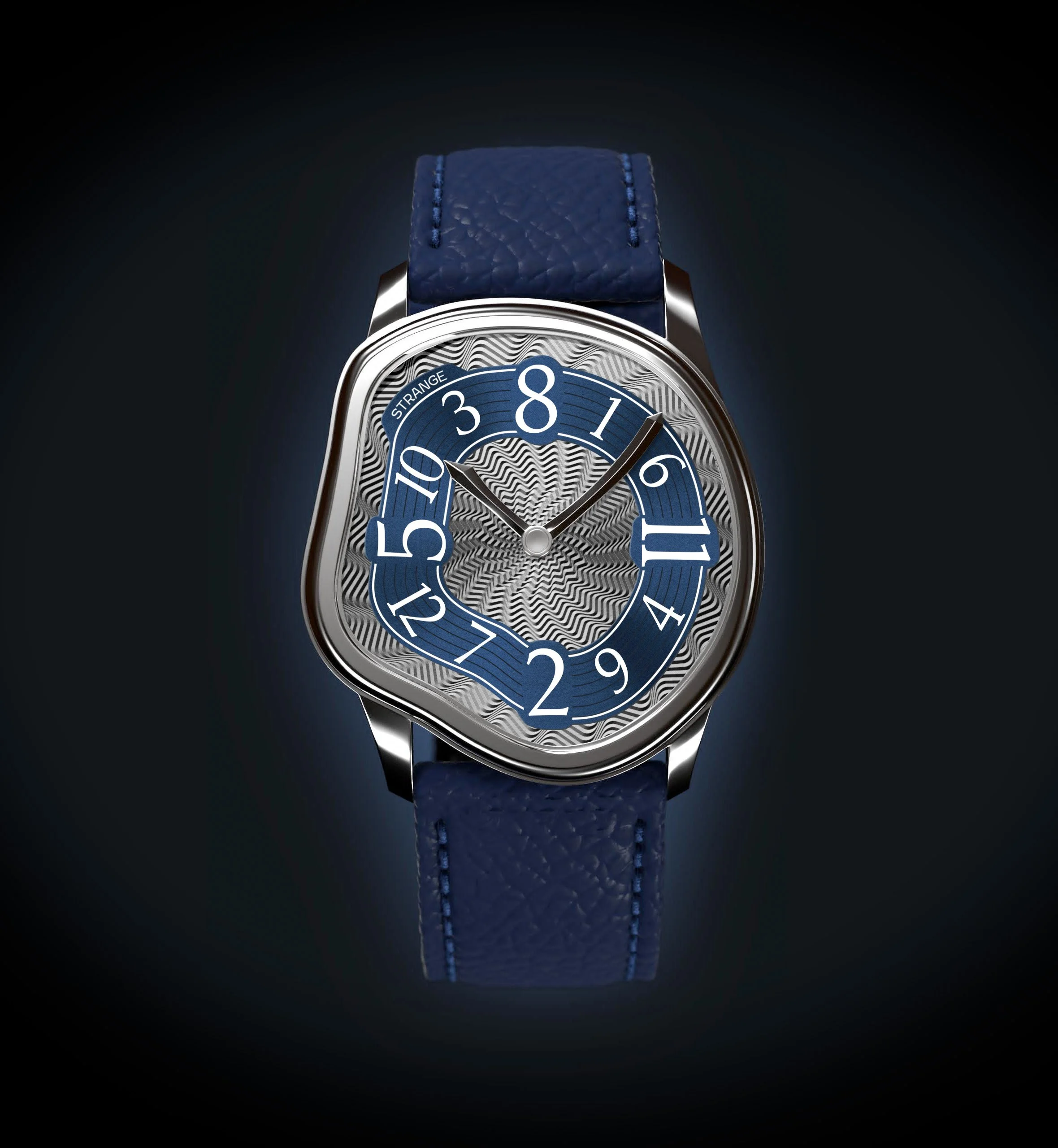
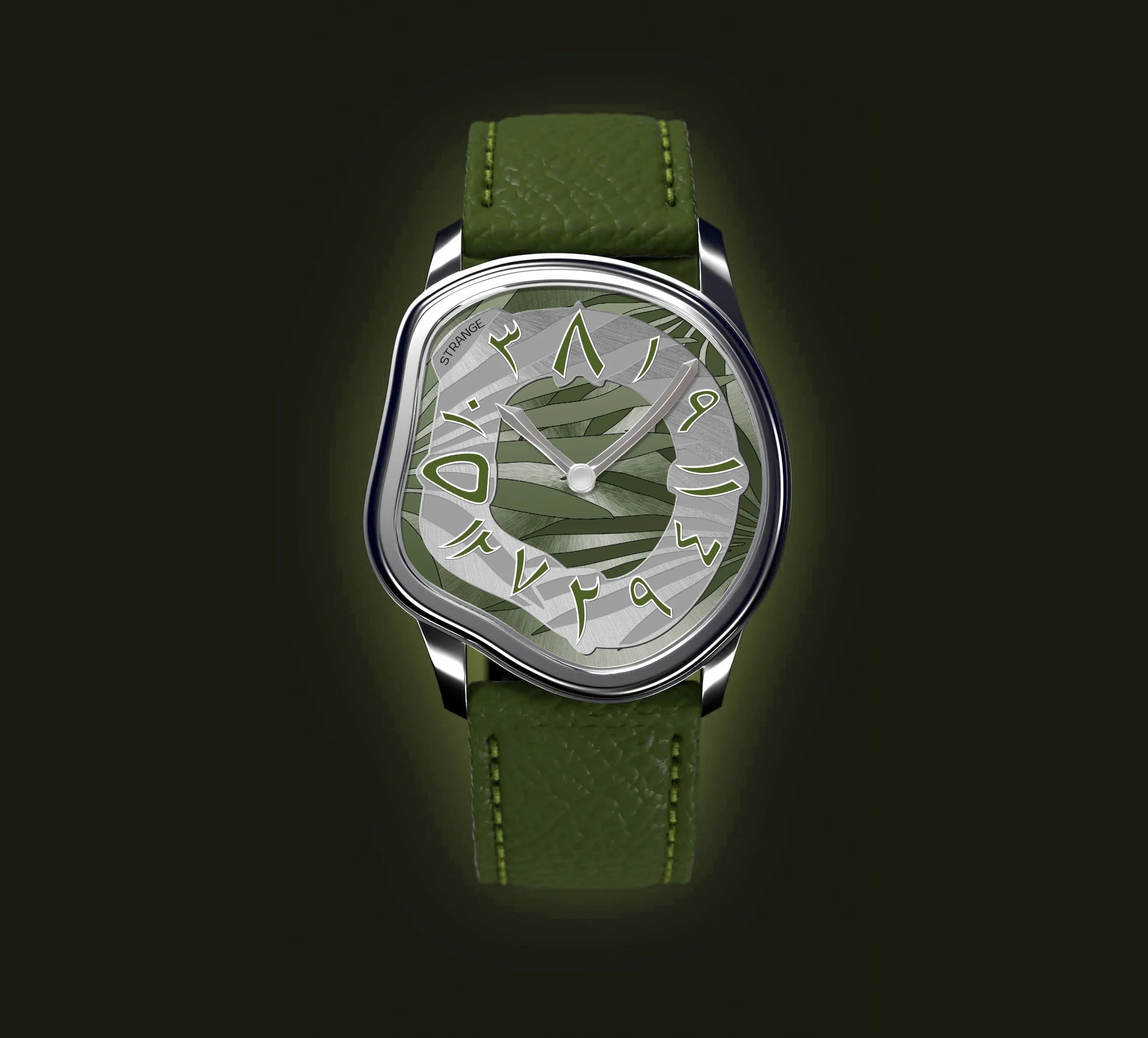
The case shape was intentionally hypertrophied — exaggerated, strange, and visually provocative. At the time, several avant-garde watch concepts with similar ambitions had already appeared publicly, which encouraged me to explore multiple directions. I proposed a range of design options, each pushing the boundaries of form to a different degree — from daring to deliberately reckless.
Even the name of the watch followed the same logic. Since my work often gravitates toward unconventional timepieces, I chose a deliberately strange and highly descriptive name that reflected the character of the design itself.
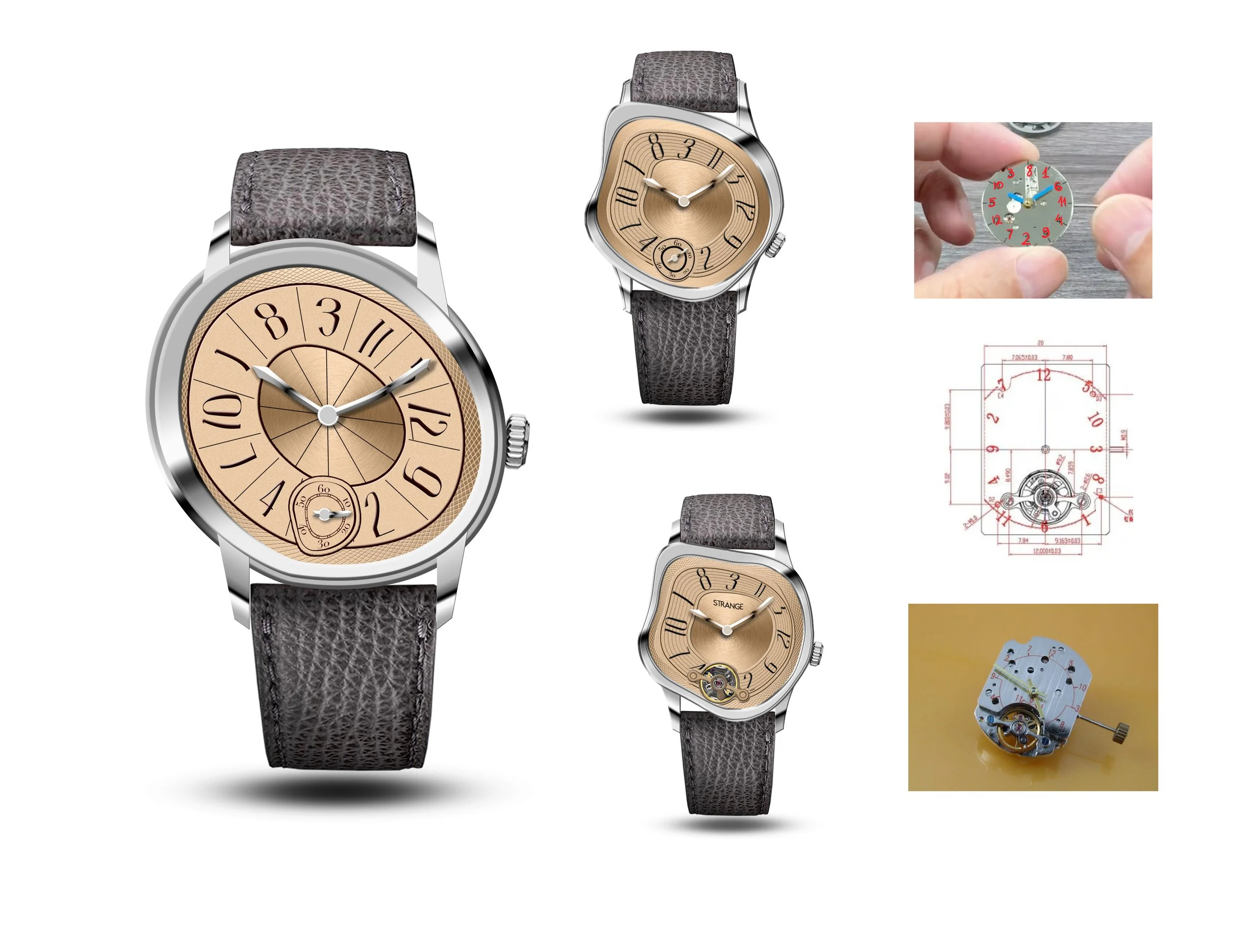
The idea of using a jumping hour hand originally came from the client, who sourced the movement from an Asian manufacturer. I then adapted the entire visual language of the watch around this mechanical feature, integrating it into a cohesive and expressive design.
Despite the project later gaining visibility and popularity, I never received payment or remuneration for my work. Looking back, this experience remains bittersweet: creatively rewarding, yet a reminder of how easily design labor can become invisible once a concept enters the public eye.
Early versions of the case design.
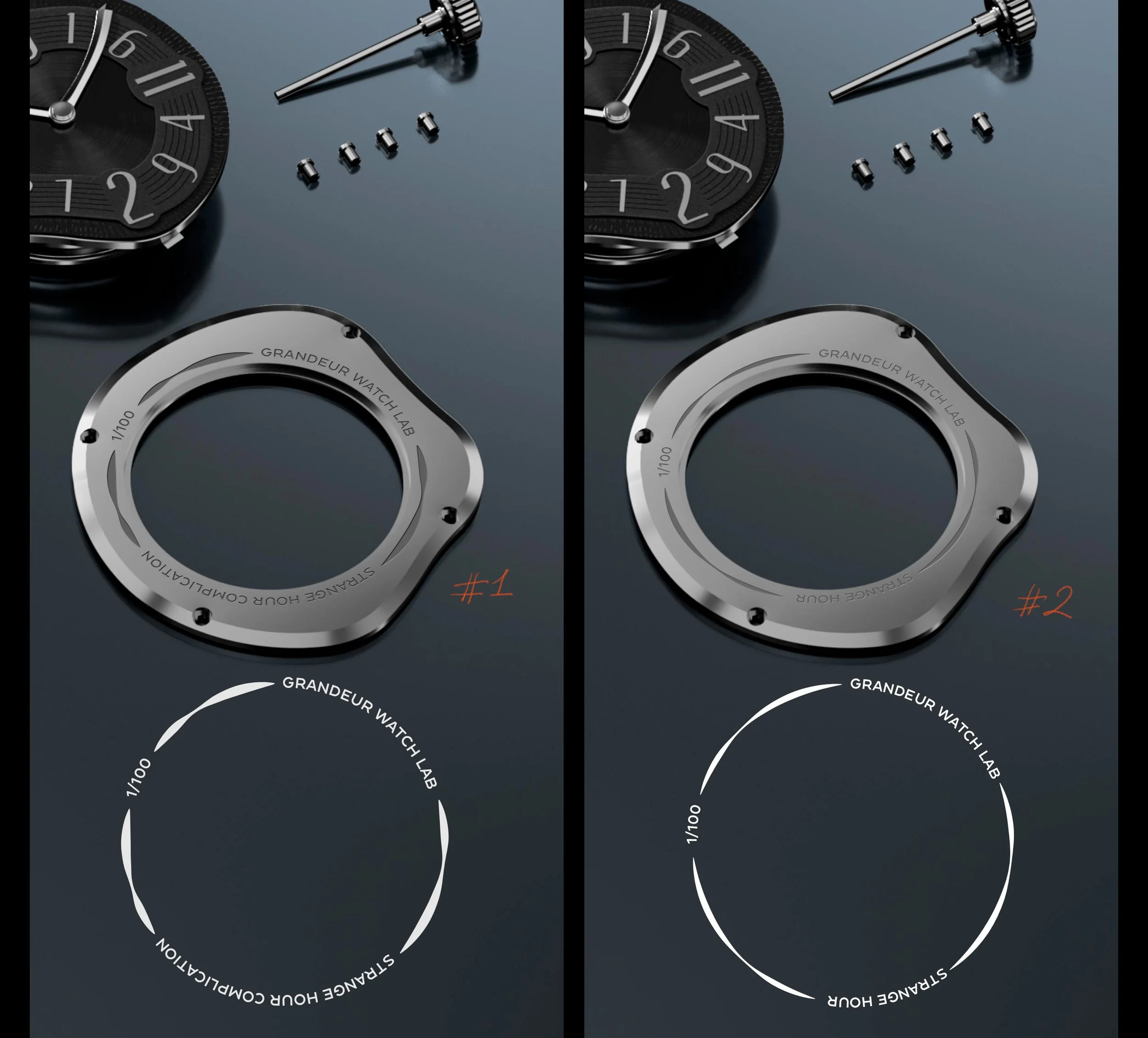
I designed a logo for that project, but it never were used in the projects.
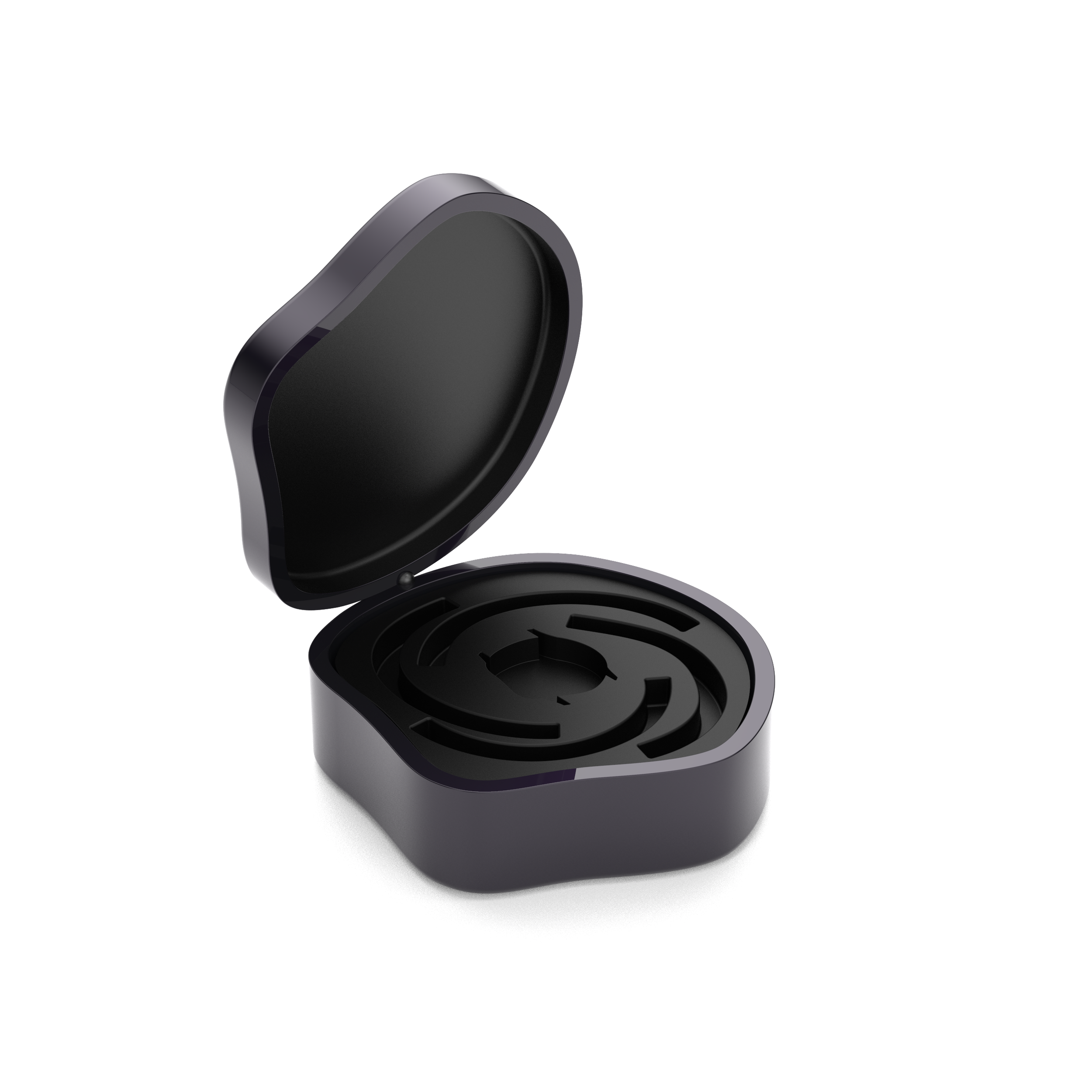
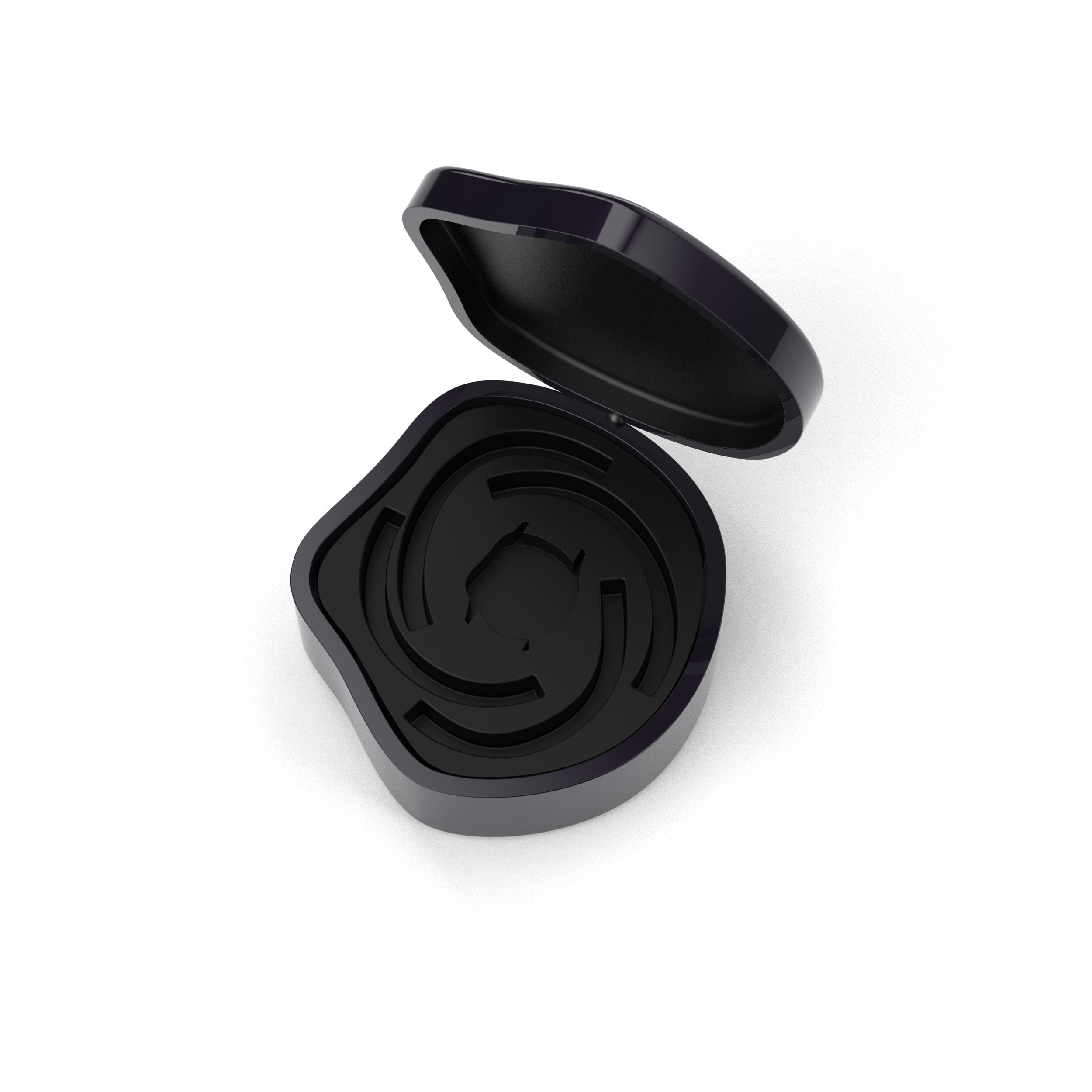
I really like the graphics of the case back, it looks so Strange.
I deigned this watch only from the front view.
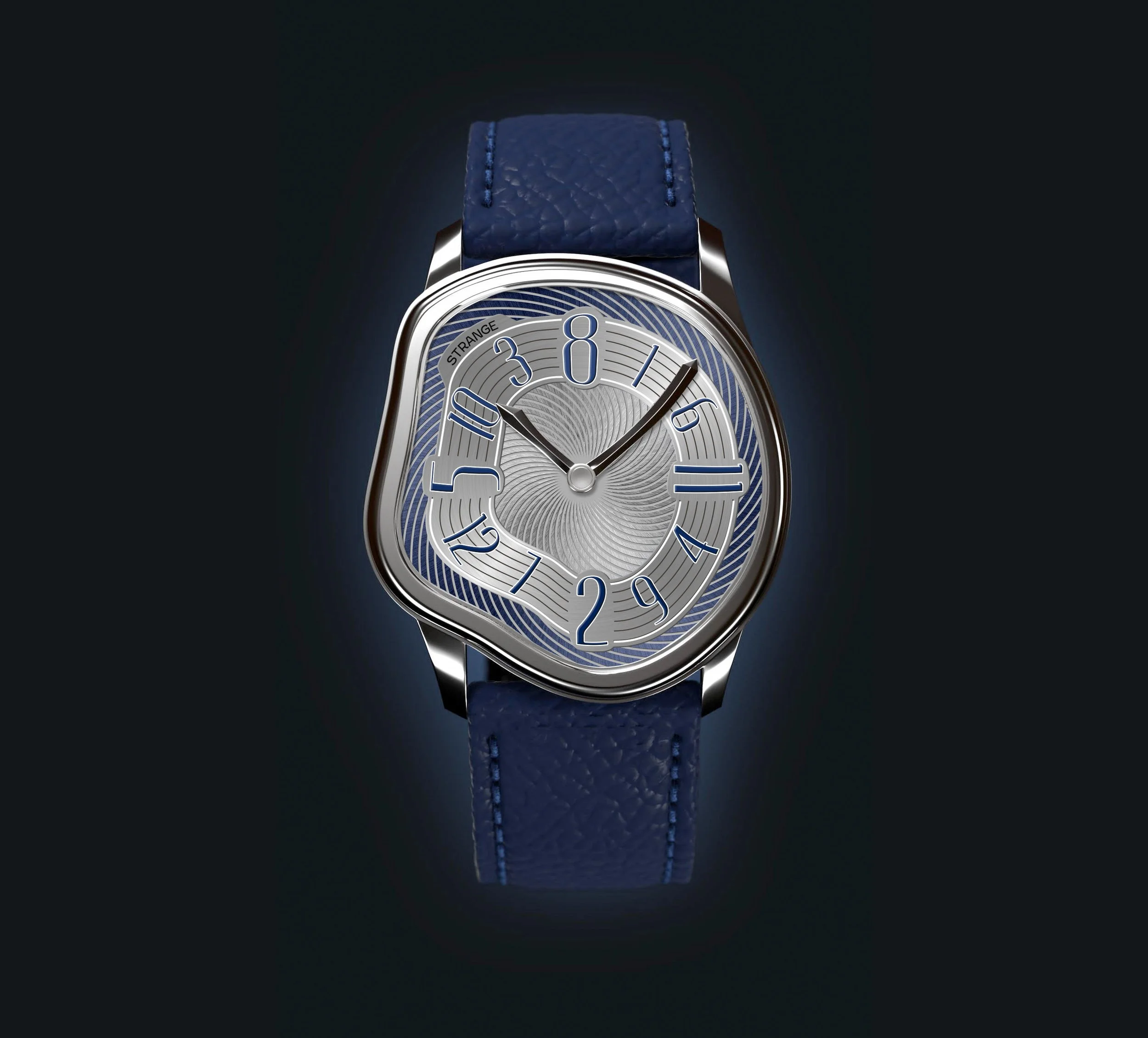
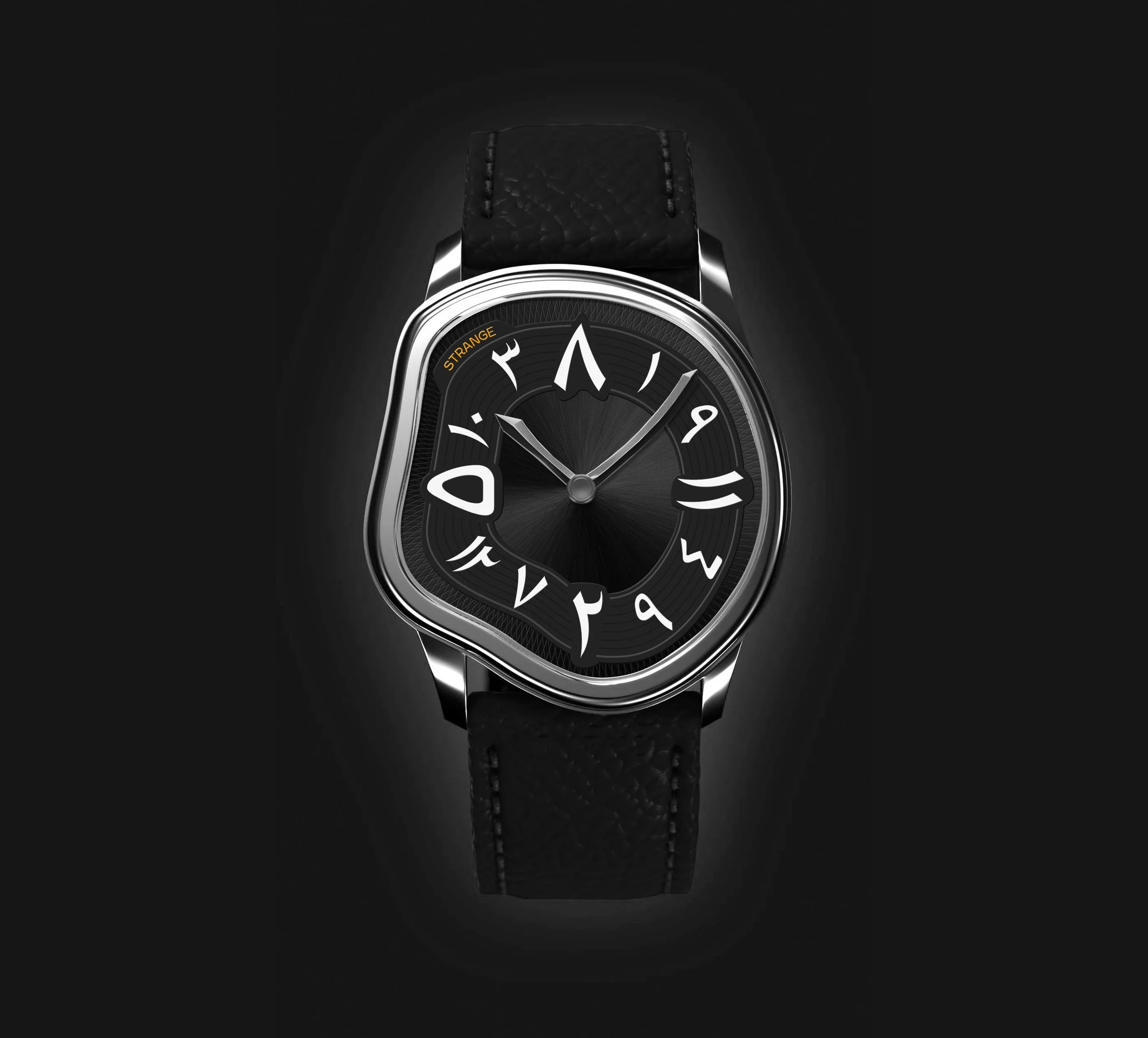
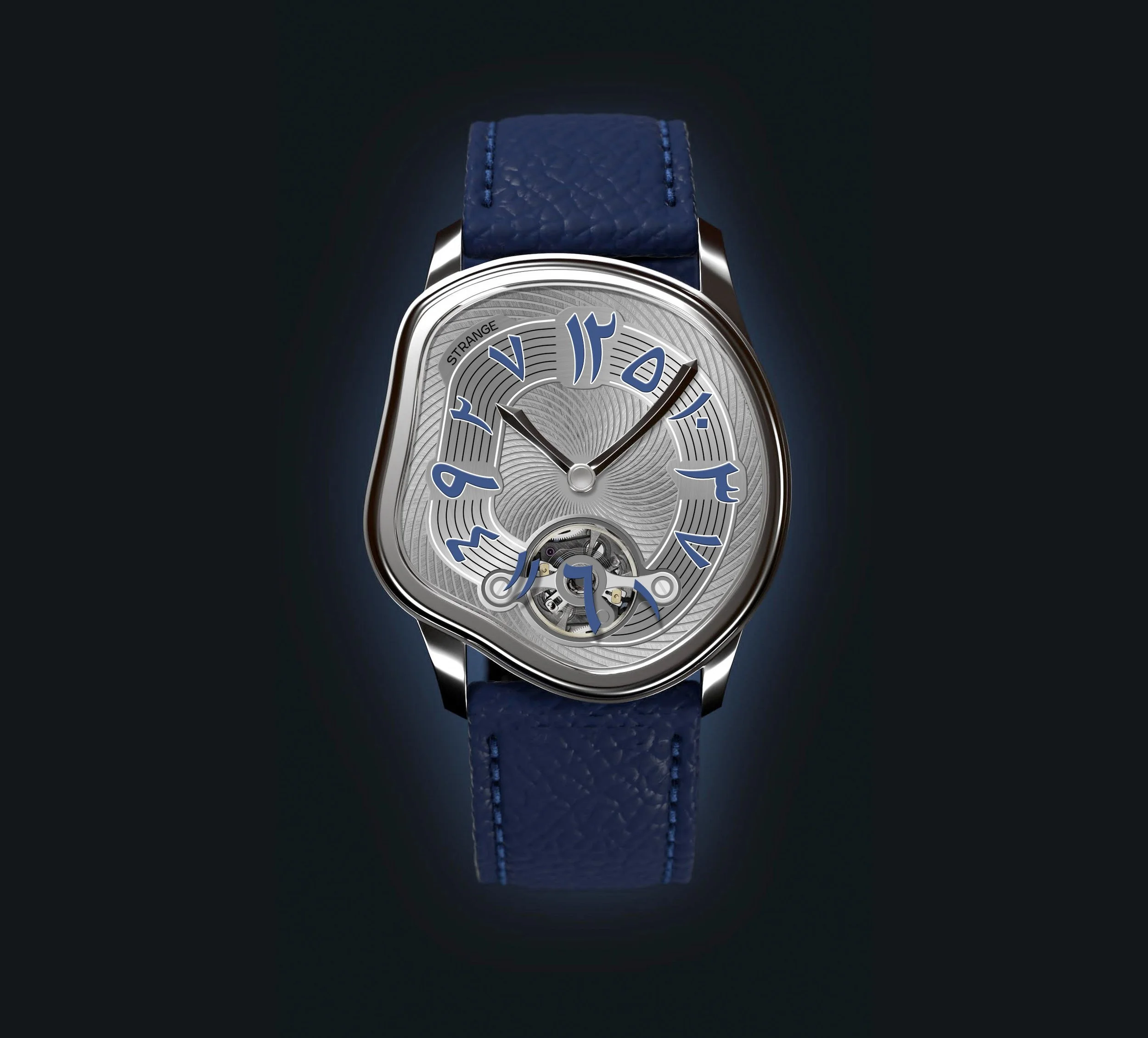
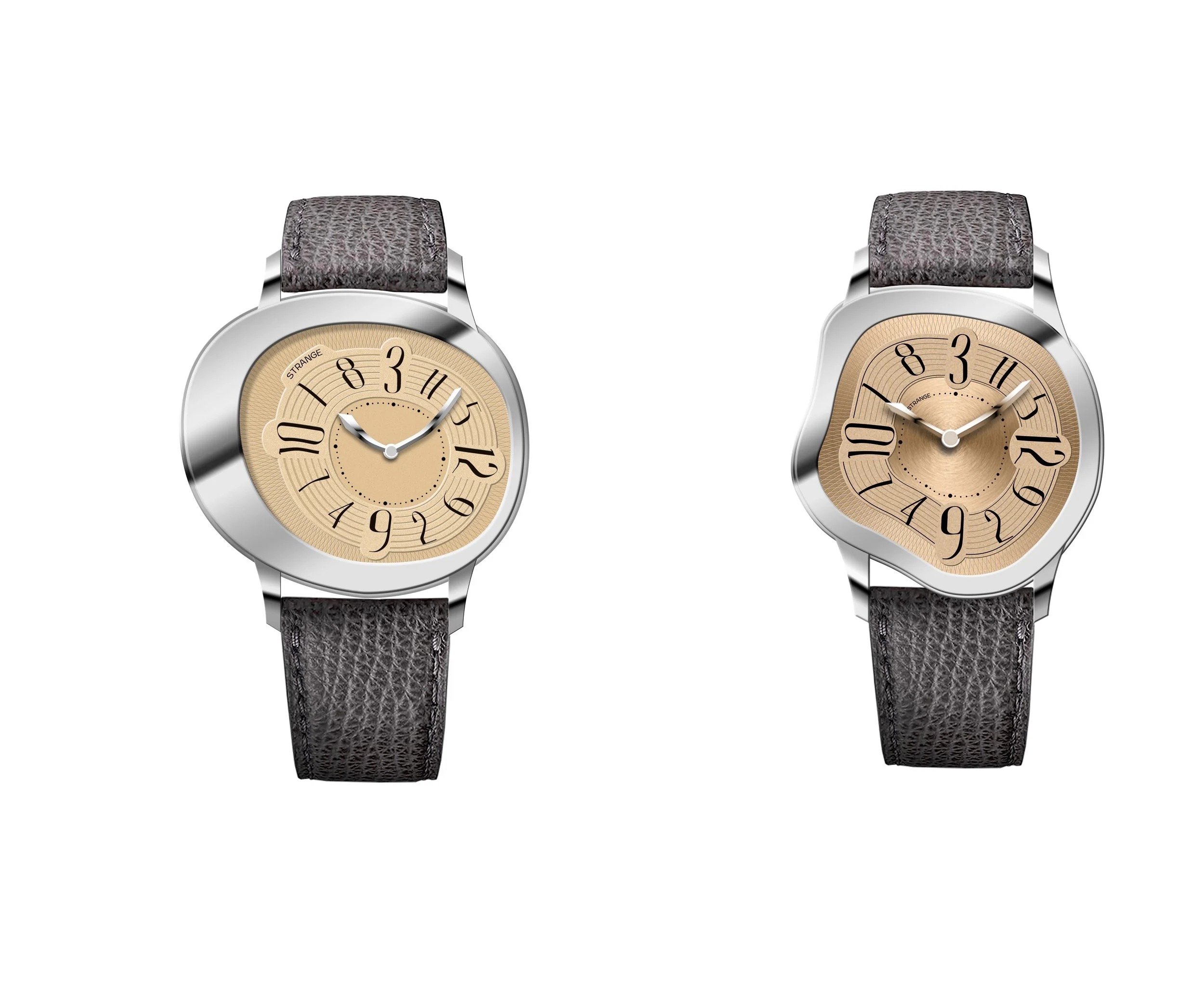
My idea of having 4 different straps in one case was done without my permission.